With a jersey as timeless and nearly unchanging as the New York Rangers’ classic red white and blue, you might find it difficult to think of a truly bad and unappealing Rangers jersey design that has appeared over the years.
However, those few jerseys exist. While this is simply my aesthetic opinion, it can be deduced that these are the worst Rangers jerseys to ever grace the ice to date from bad, to worst.
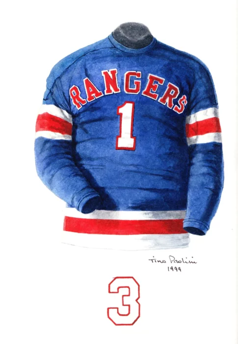
10. New York!

The 1990s was a rough time for the NHL and jerseys did not miss out on the struggle. Many teams had a rough patch in jersey designs notable of which was the Los Angeles Kings’ “Burger King” jersey which Wayne Gretzky was forced to wear… However, this jersey concept which thankfully was never printed onto cloth, is quite an eyesore. With a red base which is rarely seen on Rangers jerseys, the colors usually ranging from white, blue, to navy blue, the jersey’s red color isn’t what’s immediately jarring. What is, in contrast, is the bold white “NEW YORK” which lays diagonally across it. A keen eye might determine that what is usually written on the Rangers jersey is a diagonal “RANGERS” not a diagonal “NEW YORK,” making this jersey give off an uncanny valley feeling. It’s unsure who we have to thank that this jersey never made it out onto the ice, but the rest on this list weren’t so lucky.
9. Silver Lady Liberty

While Wayne Gretzky missed out on the NEW YORK sweater, he surely didn’t miss out on this one. While I am personally a huge fan of the navy blue 90’s lady liberty design, the white and silver design does not suit it well in my opinion. The contrasting colors is not pleasing and combined with the red shorts and playing on the ice, watching this jersey live was probably a nightmare.
8. Alternate

Back on the “NEW YORK” trend, this jersey was significantly better than the number 10 spot with the coloring and overall layout of the jersey, however the uncanny valley feeling is still present.
7. 1926 Knitted Sweaters

The New York Rangers, members of the National Hockey League, are working hard in preparation for the opening of the hockey season. They will make their first home appearance in New York Nov. 18, 1928. Left to right top row, Billy Boyd, Butch Keeling, manager Lester Patrick, Ching Johnson, Myles Lane, Taffy Abel, Paul Thompson. Bottom Row–Trainer Harry Westerby, Murray Murdock, Frank Boucher, Bill Cook, John Ross, Leo Bourgault, and Bunny Cook. (AP Photo)
The New York Rangers being an Original Six team, means that the jersey journey had to start somewhere. That somewhere being the original knitted sweaters sporting the diagonal RANGERS lettering that have since stayed since the formation of the New York team. While this photo is in black and white, you know the signature red white and blue was ever present and while this isn’t a terrible jersey, it is certainly different than the ones we’re used to seeing, but some old class charm never hurts and it would be great to see a similar style to these jerseys back on players someday.
6. 1976 Curved Shield

When I said old class charm never hurts, I did not mean this type of old class charm. The Rangers had a range of updates to their signature shield logo, some making it sharper, some making it curvier like this design. It does not sit right with me seeing this design on a jersey, as I’m used to the sharper designs, however an older fan would probably like to disagree.
5. 1946 Horizontal Rangers
The old class charm especially does not help this jersey. A horizontal RANGERS with the letter at the front can make even a Devils fan uncomfortable. While this is a very old design, it makes you glad that they didn’t stick with this one.
4. Stadium Series Disaster

As you have probably found out by now, the Rangers seem very keen on repeating the same terrible designs every few decades. This Stadium Series jersey was victim of that decision. The diagonal NEW YORK continues to haunt me and the white background especially makes it worse. I’m sure these looked terrible on camera, and even worse on the ice.
3. Mustard Practice Jersey

There is nothing more slandering and evil to the eyes of a Rangers fan than plastering the gorgeous Lady Liberty design on the grossest mustard yellow color. Preds fans will likely disagree but no Rangers jersey should be any color other than red, white, or blue, in my humble opinion. This jersey is a disgrace. It is a blessing that this was only a practice jersey, but it makes you wonder why someone would even consider turning this jersey into a reality.
2. Winter Classic Disaster

Other Rangers fans might disagree but this is the second worst jersey on the list for a reason. The font being off, the letters being too close together makes my stomach churn. The horizontal red and white stripes not being aesthetically pleasing at all, proving my theory right (that no hockey jersey should ever include horizontal stripes on the main torso.) And the N.Y. crest sitting squarely out of place on the left corner of the chest. What a disaster.
1. Winter Classic Nightmare

Good Winter Classic jerseys are hard to come by for reasons unknown to me. Jersey designers seem set on creating the worst jersey concepts known to man. While ex-Rangers goalie Henrik Lundqvist has the classiest style in the NHL and makes almost anything look good, even he couldn’t save this nightmare of a jersey. The curved shield is somehow worse than the 1976 one and the off-white beige color does not help much along with the horizontal stripes. This jersey should have never been designed let alone worn.
In my quest of finding the worst Rangers jerseys, I must admit it was extremely difficult. The Rangers having some of the classiest, timeless jerseys in the league it was hard to find notable variations. Which is why we’re stuck with 3 NEW YORK entries on this list and nothing overly deplorable. However, that just shows how good the Rangers franchise is with sticking to their original branding and designs. Yet, we are still met with subpar jersey designs here and there. While these jerseys are especially unholy, remember that beauty is in the eye of the beholder, or in this case, the New Yorker.