It is time to rate the 2022 FIFA World Cup kits with the tournament just less than two months away. The three main World Cup brands of Nike, Adidas and Puma have revealed their designs with the nations already participating in international play with the new kits.
Here are the rating of some of the most popular kits to be displayed during the World Cup:
Argentina
Grade: 8/10
Argentina will bring back the classic solid celeste and white vertical stripes in the front of their kits. Adidas has also added a black boarder onto parts of the shirt. However, Adidas made two thin lines and two outer lines in the back of the kits. Argentina’s away kit display a blue/purple design with purple flames on the bottom and light purple Adidas lines.
This is different than the traditional dark blue away kits from the years prior. The back of the Argentina home kits will take time to get used to. However, the purple away kit is a different addition to Argentina with a unique design suiting the kit well.
Brazil
Grade: 10/10
Brazil will always have their traditional yellow kits with green outline. Nike kept it simple by not adding the collar to the kit like in previous years.
They also made their away kit unique, keeping the blue but adding a fade of green on the sleeves. This is arguably Brazil’s best World Cup kits in a very long time. Nike went above and beyond to making a solid kit for the five-time World Cup winners.
England
Grade: 8.5/10
England could have received a 10/10 score… if it wasn’t for their away kit. Their home kit will display an ombre of light and dark blue near the shoulders and collar. This makes it one of the best-looking home kits in the tournament. Nike steered away from its boring white and dark blue to added some more color to the kit.
However, instead of an all-red away kit, they chose to go with a blood orange and light blue look. The whole kit is blood orange with the logo, Nike symbol and collar having a trim of light blue. This can take time to get used to, since it’s a different shade of red than the flag of England.
France
Grade: 8/10
Reigning World Cup winners France will look to become the first nation to win the tournament twice in a row. They will display a simple look, with Nike coming up with the most straight-forward look for their kits.
Nike have removed the red line from their kits used last season. They instead replaced it with an all-navy blue look with a gold trim of the Nike symbol and crest. They added some design to their away kits, adding off white fades over the white color. Though keeping it simple, it is one of the more blander kits this World Cup.
Germany
Grade: 7.5/10
Adidas has made a drastic chance to Germany’s kits and it has not suited well with fans. They have eliminated the colors of Germany in the front of the kit like it was used in previous years. Instead, they will have a white kit with one big vertical black strip down the middle of the shirt, along with the Adidas lines and moving the colors of Germany to the collar.
This has not gone well with fans, as many think the kit looks plain and that Adidas put no effort into making a decent kit for Germany. The away kits have a dark red pattern on top the black on the. The design does not look symmetrical, and it does not sit well with the gold trim of the Adidas lines and logo. Overall, Adidas did a poor job of the design for the four-time World Cup Champions and top favorites to win it all.
Ghana
Grade: 6/10
Puma have been criticized for its World Cup kit designs, and this is one of the reasons why. The African nation of Ghana are heading back to the World Cup after failing to qualify back in 2018. The design of their home kit is extremely bland, with just one black start in the middle between the crest and Puma symbol, with the red, yellow, and light green colors of Ghana on the sleeves. The design is poor and very boring compared to the World Cup kits from previous years.
Their away kits may be worse, with an all-red design and a big box on the center of the kit with the black star, crest, and the colors of Ghana in a triangle pattern. The design of the red also has a darker vertical red line running through the kit, making it look extremely off putting. Unfortunately, Ghana will have one of the least attractive kits during this year’s World Cup with Puma getting it all wrong for the West African nation.
Portugal
Grade: 8.2/10
Cristiano Ronaldo’s Portugal will display a different kit than recent years that have some fans on the fence. The kit Nike chose for Portugal is a red top half and a diagonally cut green bottom with the usual gold trim. This would have been a great idea if the shorts were not green. In the flag of Portugal, there is more red than green. Therefore, fans think it is off-putting that the home kits display more green than red.
However, their away kits look decent, if not very well with the flag of Portugal across the all-white shirt and a black trim. However, the positioning of the horizontal flag is a little awkward, making the kit looks a little unproportional. Portugal usually display one of the best World Cup kits, however, seems like they failed to impress with their style for this World Cup.
Mexico
Grade: 9.5/10
Adidas may have just come out with Mexico’s best World Cup kits since 2014. They kept their traditional green kits with a wonderful darker green design along with the red Adidas lines and white Adidas logo and crest. However, their away kits may be the best kit of the World Cup. They decided to go with an off-white kit with a lighter red design of unique shapes all over the kit.
The Adidas logo, crest, and Adidas lines are also the same color red. This has received the most compliments by several football fans. Adidas deserve a lot of credit for designing one of the best kits in the World Cup… let’s just see if Mexico can perform well with them this November.
Senegal
Grade: 7.5/10
Puma has yet again disappointed with another poor design for an African Nation’s kit. Senegal will be going to their second straight World Cup and will head to Qatar with a dull kit design. Though the collar and sleeve have the outline of the green, yellow, and red colors of Senegal, on their chest it has V-shape design of the flag with the Puma logo and crest in an all-white kit. Though it is good concept, it looks very boring.
The away kit is like of Ghana’s, with an all-green kit with a dark green line running vertically dow the shirt, and a yellow half hexagon pattern with a red strip of the flag of Senegal and crest, and the Puma logo on the top. The half hexagon looks awkward on the kit and the dark vertical green line throws the kit all off. It is disappointing to see Africa’s best nations having poor designs for their kits, however this should not stop the nations of performing the best that they can.
United States of America
Grade: 7/10
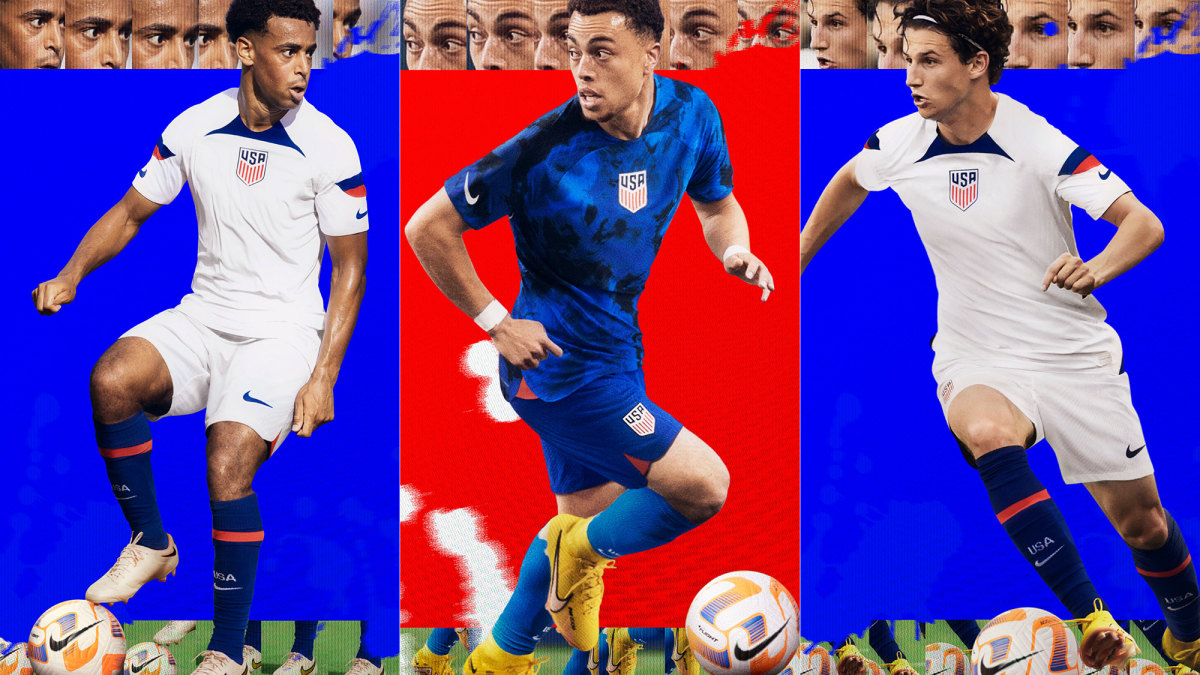
With their return to the World Cup, Nike came up with the most disappointing kit for the U.S. The home kit consists of all-white with an awkward patch of blue under the collar and a red and dark blue strip by the sleeves with the logo right in the middle of the shirt. This kit is the most old fashion looking kit in the World Cup, with very little design and a humdrum appearance.
The away kit, however, have a nice design of a blue and navy-blue tie dye look, however the location of the crest is also awkwardly in the middle of the kit. The U.S had some questioning choice of kit designs in the past, but these have been the worst since the “where’s Waldo” kits in 2012-13.


