The NBA and its franchises have sported many variations and changes to team jerseys in the fabled seventy-six-year history of the league. There have been iconic and timeless jerseys like the Boston Celtics and Los Angeles Lakers whose core jersey concepts haven’t changed in beyond decades. There have also been plenty of atrocious jersey concepts whose names and likeness I dare not speak of if only to keep them locked away from terrifying the general public again.
This author took the time to ponder on all of the NBA jerseys that have come and gone from the past forty years of the league and put together a list of the coolest jerseys that have been worn on hardwood since the 1980’s. To preface this list, this is not an assortment of the most famous or popular jerseys of the time but the most unique and aesthetically pleasing of threads arranged in no certain order. Let us take a trip down memory lane and reminisce over yesteryear when Michael Jordan first took flight in Chicago Stadium and Big Country rocked the rims of Vancouver.
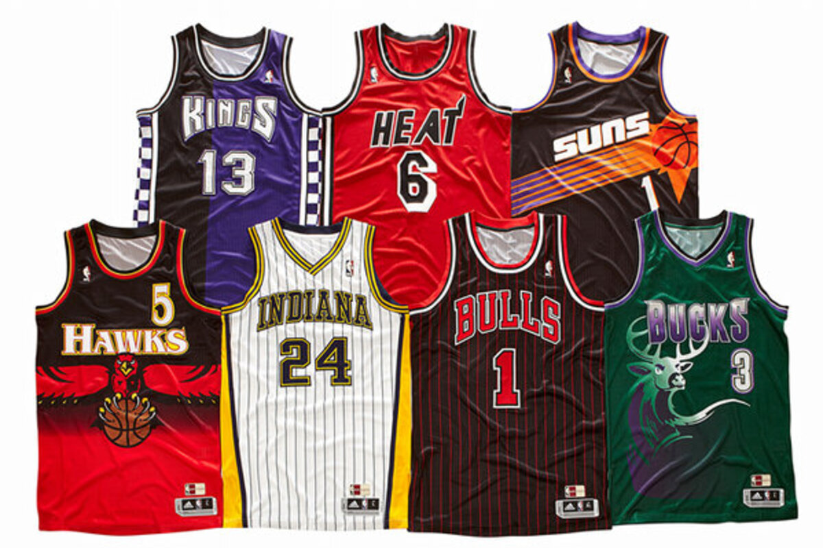
Toronto Raptors 1995-1998

Raptors HQ
Enemies have already been made with this leadoff spot. The Toronto Raptors’ original jerseys during their expansion into the NBA back in 1995 have their detractors. Some will call them gaudy and reek of the 1990’s but they just don’t make jerseys like this anymore. The ferocious velociraptor dribbling the basketball while sneering at its defender is something to behold and cherish as well as the signature 90’s purple.
These were the early days of Vince Carter throwing down raucous in game jams and taking the city of Toronto by storm with his high-flying style of basketball. It also induces the what ifs of the day, with the early Raptors squad not only boasting Vince Carter but a young Tracy McGrady as well, who ended up striking out on his own to forge a new path with the Orlando Magic later on.
The Raptors changed their jersey concept in the fourth year of their existence in favor of a more contemporary look to suit the push towards a new millennium, but this jersey will always be a favorite amongst fans and sometimes is dawned as a retro alternate on occasion for the team.
Utah Jazz 1996-2004

Essentially Sports
The Utah Jazz name will always be puzzling to those who don’t understand the history of the franchise, having departed from their original location in New Orleans at the start of the 1979-1980 season. The jersey reflected that origin up until the 1996 season when the Jazz dawned their new jersey with the purple, light blue and white primary colors sporting the breathtaking mountain in the background. This was a departure from the music centered theme of their earlier jerseys and more of a homage to their present location in Salt Lake City.
This look will arguably remain iconic due to the fame of their team during this period of time with Hall of Famers John Stockton and Karl Malone at the helm along with Jerry Sloan as their head coach. This harkens us to the back-to-back NBA Finals appearances from the Jazz in 1997 and 1998 but ultimately falling to Michael Jordan and the Chicago Bulls in those intense championship battles. The Jazz ultimately changed their look and colors temporarily after the retirement of John Stockton leading to their modern jerseys that modernize the older Jazz music themed jerseys from the 70’s and 80’s.
Atlanta Hawks 1982-1992

Fadeaway World
The Atlanta Hawks jerseys of the 1980’s were synonymous with their high-flying teams of the decade which included Slam Dunk Champion Anthony “Spud” Webb and the Human Highlight Reel himself, Dominique Wilkins.
This jersey shines in its simplicity between its color scheme and design. The eye-catching red and yellow with the smooth swoop and stylized Hawks lettering across the chest almost made the players appear faster on the court.
Wilkins contributed to the appeal of this jersey with his gravity defying dunking ability in NBA Slam Dunk Contests, prevailing as champion twice as well as the legendary battle between him and a young Michael Jordan in 1988. This was also one of Hawks most competitive eras in the NBA, winning two division titles during the decade but falling to eventual champions like the Detroit Pistons and Boston Celtics deep in the playoffs.
Orlando Magic 1998-2003

Orlando Pinstriped Post
The Orlando Magic’s jerseys from this time period invoke the memories of Tracy McGrady in his prime, dicing defenses for two scoring titles in his four years with the team. The jerseys were woven with reflective material that made Magic fans wonder if they were watching sun-catching crystals race down the court in TD Waterhouse Centre.
The star in the middle of the name subtly paid homage to Disney’s presence in the Orlando area but not quite as on the nose as far more recent alternative jerseys have. You would have thought McGrady was a wizard the way he was able to score during this period of time and lead the Magic to the playoffs on multiple occasions but unfortunately falling short of any significant success in the white and blue.
This jersey era was short lived with the departure of McGrady and the drafting of Dwight Howard but this early 2000’s gem still lives on in the occasional retro jersey throwback games.
Chicago Bulls 1979-1985 Away

Undisputed
This jersey was adorned by the likes of Reggie Theus, Orlando Woolridge and Hall of Famer Artis Gilmore. Who could argue though that this jersey was worn more iconically than a young Michael Jordan?
Jordan only wore this away jersey for one year in his rookie season but the impact His Airness had on the game of basketball from the beginning culturally is difficult to quantify. The 1985 Slam Dunk Contest had Jordan wearing this jersey, squaring up against legends like Julius Erving, Clyde Drexler, Dominique Wilkins and Larry Nance in which Wilkins prevailed.
The jersey is forever tied as well to the mythical Air Jordan 1’s, the most popular and controversial pair of basketball shoes ever constructed. The same argument made for the Hawks jersey will be made here, less is more. The beautiful cursive black Chicago stretched across the chest outlined with white is one of the more simple but elegant designs the NBA has seen. Who knew that NBA jerseys could be considered elegant or classy, but this may take the cake.
Phoenix Suns 1992-2000

John Swart / AP
What can be said about the colloquially termed “sun-burst” Phoenix Suns jerseys of the 1990’s? The Suns jerseys of this time were considered sleek and modern, encapsulating all the tropes and stereotypes of the 90’s. Whether it was the home white jerseys or the away purple jerseys, you couldn’t go wrong rocking one of these down the street.
The splendor of the basketball shooting through the jersey as if it had been empowered by the Arizona sun to bludgeon any NBA victims in its path. We can’t go without mentioning the futuristic Suns font to punctuate the feel that this team was going for: a fast and free flowing basketball team that sought to light the hoop on fire with its rapid shooting and electrifying jams.
This jersey era is nostalgic for many Suns fans being one of their more successful eras of basketball outside the mid 70’s and the present. Charles Barkley won his only MVP award in 1992 in his first year with the Suns and led them to a Western Conference Finals win but eventually perished as one of the many victims of the Chicago Bulls dynasty of the 1990’s.
The Suns were a well-constructed team outside of Barkley during this time including players like Kevin Johnson, Dan Majerle, Danny Ainge and Danny Manning as well as young versions of Jason Kidd and Steve Nash. The Suns as of this year brought back the sun-burst jersey as an alternate so it will be exciting to see the players of this era gallop down the court in this 90’s jewel of a uniform.
Vancouver Grizzlies 1995-2000

Blazers Edge
How can you not love the teal color popular in 90’s fashion? If your friends don’t teal and if they don’t teal, then they’re no friends of mine. The Vancouver Grizzlies were short lived, only lasting six seasons in Vancouver before being sold to new ownership and moved to Memphis.
There was nothing overwhelmingly impressive about the Grizzlies during this period of time. They drafted Shareef Abdur-Rahim, Mike Bibby and how can we forget Bryant “Big Country” Reeves? They were bottom dwellers in their division for the first six years of their expansion despite high profile draft picks but were not considered a valued destination by many including the infamous saga with Steve Francis.
The only wish could’ve been for the Grizzlies to have retained these jerseys upon the arrival to Memphis and just revamped them slightly to account for their location change. They kept the same color scheme but like many transitions into the 2000’s, they were boring and lackluster in their design.
The Vancouver design is infectious to me. The bear claw scratches on the in-your-face white lettering with the teal, dark orange and black color scheme as well as the Haida lettering on the black trim of the jersey paying respect to the indigenous people of Vancouver. Some may find it too busy or obnoxious, but this look reminds us of the NBA’s efforts to expand into Canada and other countries to spread basketball globally. The Grizzlies recently have brought the jersey back as a retro alternate so this jersey iteration will not die as of yet.
Miami Heat 2017-Present City Edition

Jasen Vinlove / USA TODAY Sports
You have now reached peak 80’s nostalgia with the Miami Heat City Edition “Miami Vice” alternate jerseys. You can literally pick any one of these jerseys starting from 2017 until now, drape them across a wall and throw a dart blindfolded without error or faux paus.
These are can’t-miss in terms of style and creativity, creating a somehow nostalgic yet simultaneously modern feel as if 80’s Miami culture was intertwined with Future Funk and manifested into an NBA jersey. There is the original solid white City Edition made up of pastel pink and blue with the cursive Miami across the chest or the later iterations that had solid pink, blue, black and gradient versions.
The color scheme, the lettering and the arrangement of colors for the trim is almost the perfect NBA jersey. You may not see a more impressive balance of style, coordination and color than these jerseys rolled out in the late 2010’s. You will not find many modern NBA jerseys to get excited about. Many are dull, uninspiring and hastily put together nods to corporate sponsors and lazy appeals to the past, but this Heat City Edition jersey is a chef’s kiss. This may be a controversial statement but there may not be a better NBA jersey created up to this point.