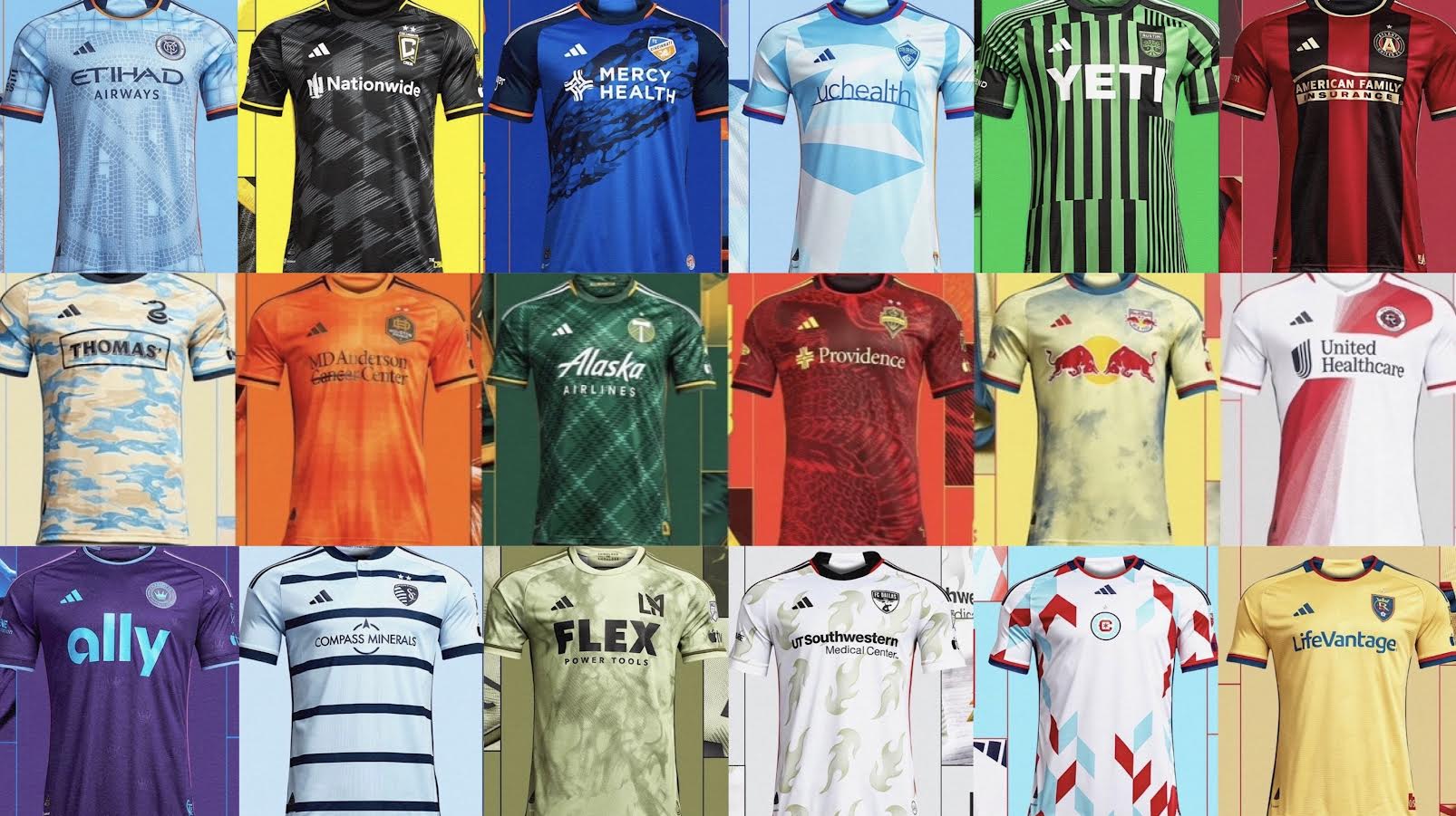
Grading the 2023 MLS Kits with the season kicking off in a little over a week in what is one of the best waves of jersey we have seen thus far. Here are some of the team’s grades for their kits this season:
New York City F.C
Grade: A
The boys in blue are keeping their traditional Bronx blue, however adding a touch of New York City in their kits. The new “Interboro” kit pays homage to the multicultural in New York, representing the five boroughs and every New Yorker in the city. Its kit has a shadow of the logo on the front, keeping its orange trim with the famous Etihad Airways sponsorship in the front.
Columbus Crew
Grade: A+
The Crew are changing its secondary kits from an all-white to an all-black, with yellow trim for the 2023 season. The “veloCITY” kit represents speed and excellence in the city of Columbus, who will look for another MLS Cup since 2020. Its silver pattern with the traditional Nationwide sponsorship stands out the kit, making it one of the best ones for 2023.
F.C Cincinnati
Grade: A+
Cincinnati have completely redesigned their home kit, and for the better. They will ditch the navy blue and move to a lighter blue with a dark wave pattern across the kit, while keeping its orange trim. The “River” kit is supposed to represent the bridges that connect the city and its landmarks. Its unique pattern of blues is what will make their kit possibly the best in the MLS this season, a huge upgrade from 2022.
Colorado Rapids
Grade: B
The Rapids are going in a completely different direction and are changing their home kit to a baby blue. The “New Day” kit is in support of mental health, which will be their initiative throughout this season. The unique patterns of blue with yellow and red outline add originality to the kit, something that has not been seen in Colorado yet.
Austin F.C
Grade: D
Coming off their best season thus far, Austin came out with a rather disappointing home kit for 2023. “La Voz de Austin” ditches the traditional six thick green and black lines and added more lines, with an uneven patter all over the kit. This is a step down from their kits last year, which almost resembled the iconic Inter Milan kits from 2010. However, they will keep its green and black pattern with the Yeti sponsorship in the middle.
Atlanta United
Grade: B+
Atlanta has made significant changes to their home kits from last season, making an even tone of red and black with its gold trim. “The 17s” honors its first kit from its inaugural season back in 2017, going back it its horizonal red and black lines. Their kits are like A.C Milan’s infamous red and black horizonal lines.
Philadelphia Union
Grade: C+
The Union decided to go with a sand camouflage home kit for their raining Eastern Conference Champion season. The “For Philly” kit is a message of Philadelphia’s toughness in their playoff runs the last few seasons. However, they’ll ditch its navy blue and gold kit, which was one of the best-looking ones in 2022.
Houston Dynamo
Grade: B
Houston made little to no changes to its kit from last year, except adding a square faded pattern. The “Texas is Orange” kit represents the team’s philosophy of the best team in Texas, in which Houston is the only team in Texas who has won the MLS Cup. They will look to keep that title and bounce back after a poor 2022 campaign.
Portland Timbers
Grade: B+
The Timbers upgraded their kits for 2023, ditching its half and half green shirts to a plaid design. The “Plaid Kit” looks much like a Christmas sweater, with a warm approach to it. They will continue using Alaska Airlines as their sponsor and keeping its gold trim around the kit.
Seattle Sounders
Grade: B-
The Sounders decided to go to a different approach with their kit, honoring the famous Bruce Lee and his impact on the city. The “Bruce Lee” kit has a yin yang in the back of the shirt, with red and yellow patterns of Indian graphics on the sleeves. Despite the symbolism, Seattle has been known for its infamous lime green colors for its sports teams, making it hard to adjust to the new red kit. They also have a change of sponsor, moving to Providence that will be displayed in the middle of the kit.
New York Red Bulls
Grade: B-
The Red Bulls will display a yellow kit with blue patches in honor of the street art of New York. The “Daniel Patrick” kit is inspired by the sportswear designer’s work in the field. However, the Red Bulls have never been very colorful with their kits, which may leave a sour taste for fans.
New England Revolution
Grade: A
New England are keeping it simple, displaying an all-white kit with red trim and diagonal pattern across the shirt. The “Defiance” kit is geared with aeroready technology for extra ventilation. The jersey gives more pop to a once boring navy-blue kit from past seasons.
Charlotte F.C
Grade: A
Instead of all black, Charlotte changed its away kit to purple, while keeping its light blue trim. The “Crown Jewel” kit featured the small crown above the ally logo with light purple lines representing the Adidas three stripes. Besides Orlando City, rarely do we see purple kits in the MLS, so Charlotte will be widening the spectrum of colors in 2023.
Sporting Kansas City
Grade: C-
Besides thinning the dark blue lines, Kansas City has not made a change to their kits from 2022. The “Hoops” kit is supposed to represent their 150-year history by displaying an old pattern of vertical lines. It is much plainer than the other kits this season, with little pop or design to the shirt.
Los Angeles F.C
Grade: B
The “Smokescreen” kit will be worn by the raining MLS Champions LAFC, paying homage to the culture built around the LAFC fanbase. It displays a green sandy look with black trim with dark tie dye pattern. The green will be something LAFC fans will have to get to used to, with no L.A team having any type of green in their uniforms.
FC Dallas
Grade: B-
Dallas came out with a “Burn Baby Burn” kit for the new season, representing the growth of the MLS through the Dallas organization. Its jersey will have faded flames with a blood orange trim with a new sponsorship with UT Southwestern Medical Center. It is a different look for the team but has faded away from their traditional red and blue which has been a symbol for the club for decades.
Chicago Fire
Grade: D
Chicago did not come out with a good kit for 2023, displaying a very odd pattern of diamonds in its traditional red and baby blue pattern and an all-white shirt. This follows the year in which Chicago had the baby blue vertical lines, another poor choice for a home jersey.
Real Salt Lake
Grade C+
Salt Lake’s “Beehive State” kit honors the people of Utah, who are named the Beehive State. They are sticking to their gold away kit, with very little change from 2022.